Carpaal
A community-driven ride-sharing app that makes finding safe, reliable rides simple.
Team:
Sole UX designer
Tools:
Figma, FigJam, Survey Monkey, Slack
Focus:
AI Integration, Safety UX,
End-to-End Mobile Design
Duration:
4 months
Project Overview
Carpaal is a pre-seed startup rethinking ridesharing as a safer, more community-driven alternative. I worked as the sole UX designer, leading the product from research through final UI design.
How Might We:
How might we transition users from "anonymous strangers" to "verified neighbors"?
How might we transform chaotic posts into a searchable, AI-matched database?
How might we ensure riders don't just find a car, but find a compatible community member?
Peer-to-peer ridesharing in the U.S. is fragmented, with many users relying on informal social media groups that lack safety, trust, and reliability. Most existing platforms also feel transactional rather than community-driven.
The Challenge
Research & Insights
Auditing regional social media forums revealed three critical failures:
The Discovery Gap: Information is buried in "random" threads; finding a ride is a time-consuming chore.
The Security Void: Anonymous, open-access groups create a "high-fear" environment.
Transactional Creep: Groups often shift from "helping out" to professional profit-seeking.
“I’ve thought about carpooling to save money, but I’m terrified of just getting into a stranger’s car without knowing who they are.”
“The biggest challenge is coordinating schedules. Sometimes people cancel last minute or it’s hard to find someone going to the same place at the same time.”
“I spend more time scrolling through Facebook threads looking for a ride than the actual ride takes. It’s exhausting.”
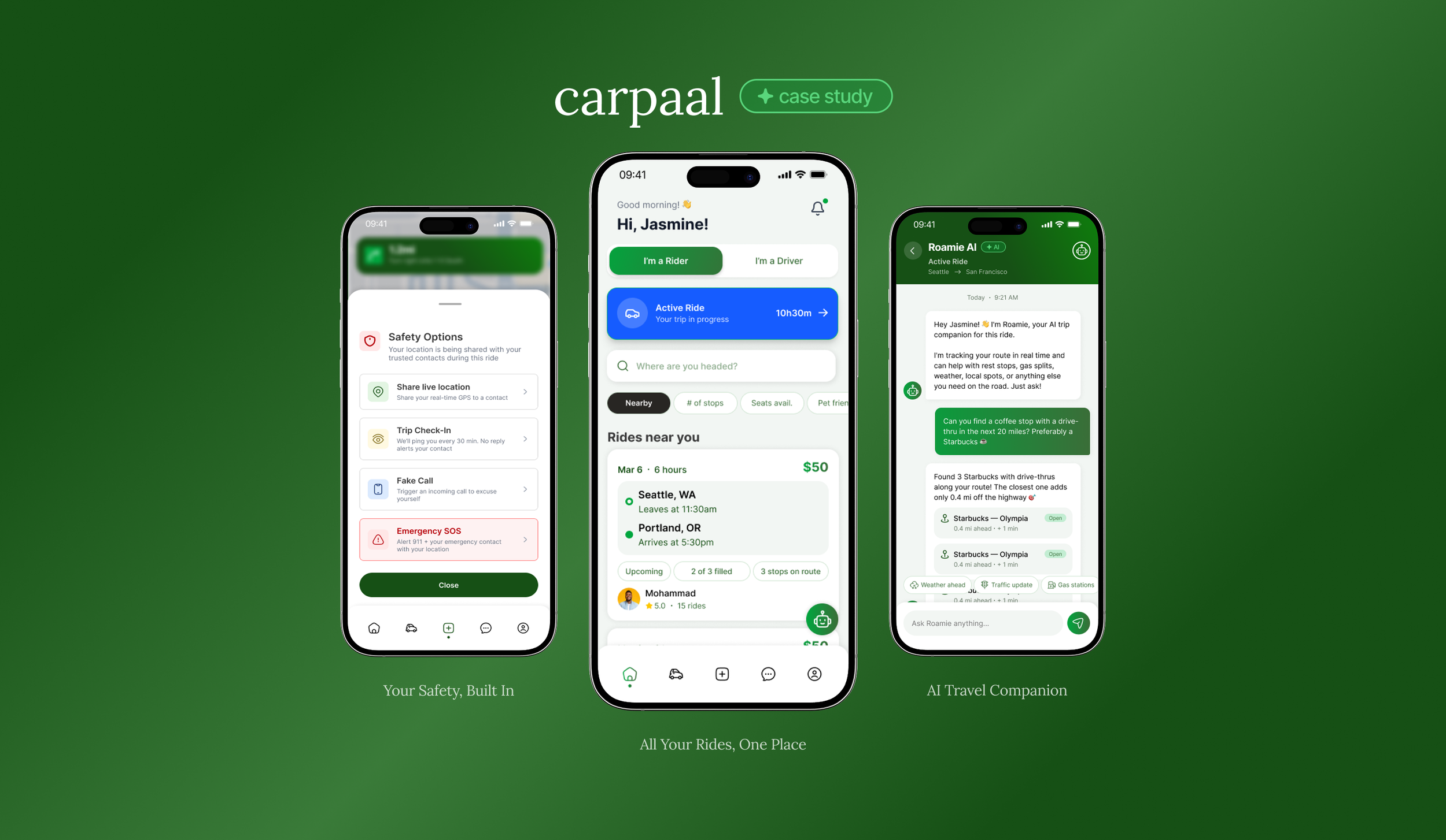
The Solution
Proprietary UI has been simplified/omitted per NDA.
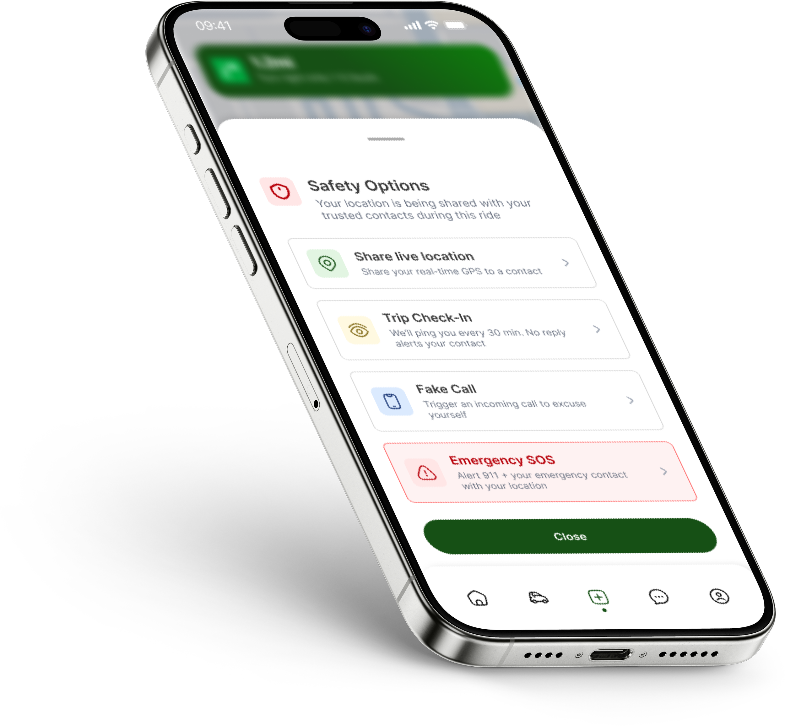
Safety Prioritization
Trust: ID verification, background checks, and user reviews enhances safety and transparency.
Safety: Gender-specific filtering and AI-powered safety features (such as emergency alerts, route deviation detection, and quick safety check-ins) provide users with added security and peace of mind.
Why It Matters: Safety concerns and difficulty verifying users was the top concern for women and first-time riders.
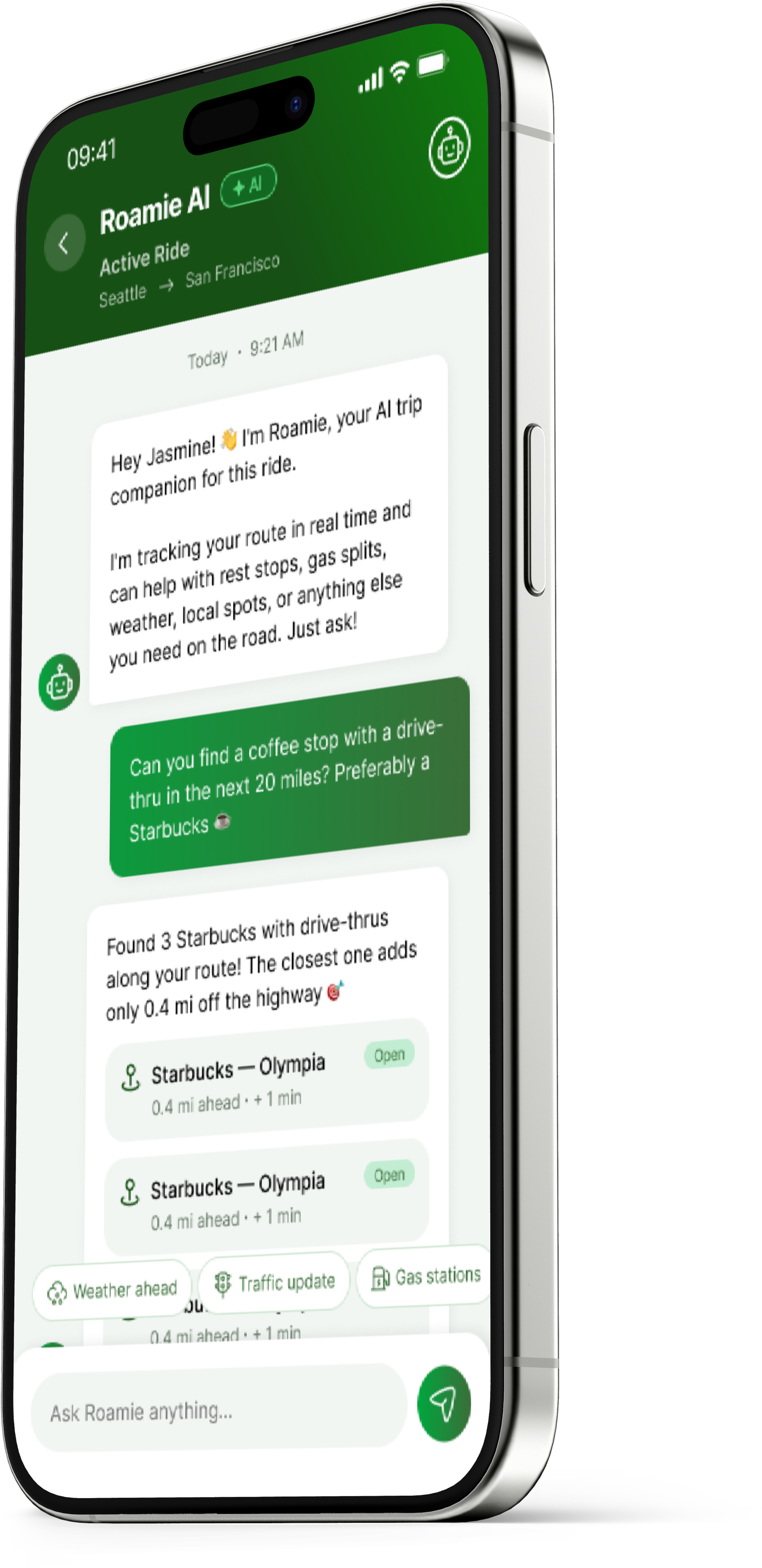
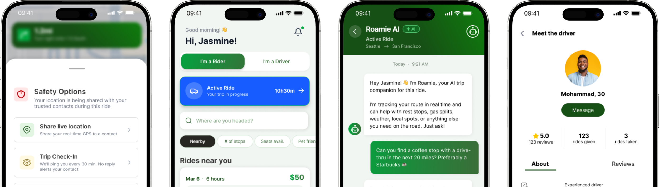
AI Smart Matching
Vibe Matching: Users can match based on shared music tastes, personality traits, conversation preferences (quiet vs. chatty), and temperature preferences to create a more comfortable ride experience.
Rapport Building: Integrated messaging with lighthearted prompts encourages pre-ride conversation, helping users feel more comfortable with their travel companion before the trip begins.
Why It Matters: Users often felt awkward riding with strangers. This system helps reduce uncertainty by letting riders learn more about each other beforehand, making interactions more natural, reducing cancellations, and improving the overall experience.
AI Direction: An AI element was requested by the stakeholder, which led to the development of vibe matching. It’s designed around the question of what would encourage users to return more frequently through more personalized and compatible ride experiences.
Outcomes & Impact
Increased User Confidence: Testing showed that most participants felt significantly more secure compared to coordinating rides through social media communities, especially due to verification and built-in safety features.
Faster Ride Discovery: Vibe Matching and improved filtering reduced the time needed to find a compatible ride from several minutes of scrolling to under 30 seconds.
Stronger Retention & Trust: The combination of safety features and Vibe Matching increased user comfort and trust, making riders more likely to complete rides and return for future trips.
Overall, the experience felt less like coordinating with strangers and more like joining a trusted, familiar community, which helped users feel at ease from the very first interaction.
Reflection
I really enjoyed working on this project because it was such a big learning experience for me. Working in a fast-paced environment was challenging at times, but it was also really fun and rewarding. I loved collaborating closely with the CEO, developers, and the rest of the team, and getting to explore AI for the first time made me even more excited about the future of design and technology.
One of the biggest things I learned from this project was how much trust and comfort influence the way people use shared mobility apps. Small details like compatibility cues and pre-ride prompts helped users feel more at ease, which showed me how thoughtful design decisions can make experiences feel safer and more human.