
A redesigned website for a beloved, local coffee shop
Sidekick Coffee

Role:
Sole UX/UI Designer
Duration:
3 months
Tools:
Figma, Squarespace
Overview
Client
Sidekick Coffee
I collaborated with the owners of Sidekick Coffee to redesign their website with the goal of improving navigation, highlighting catering options, and making it easier for users to book the café for private events.
While this was not an official freelance project, I worked closely with the owners to understand their goals and preferences, gathering feedback on what they wanted and didn’t want. This collaboration helped guide my design decisions and ensured the final redesign reflected both the brand’s personality and the needs of its users.
The Problem
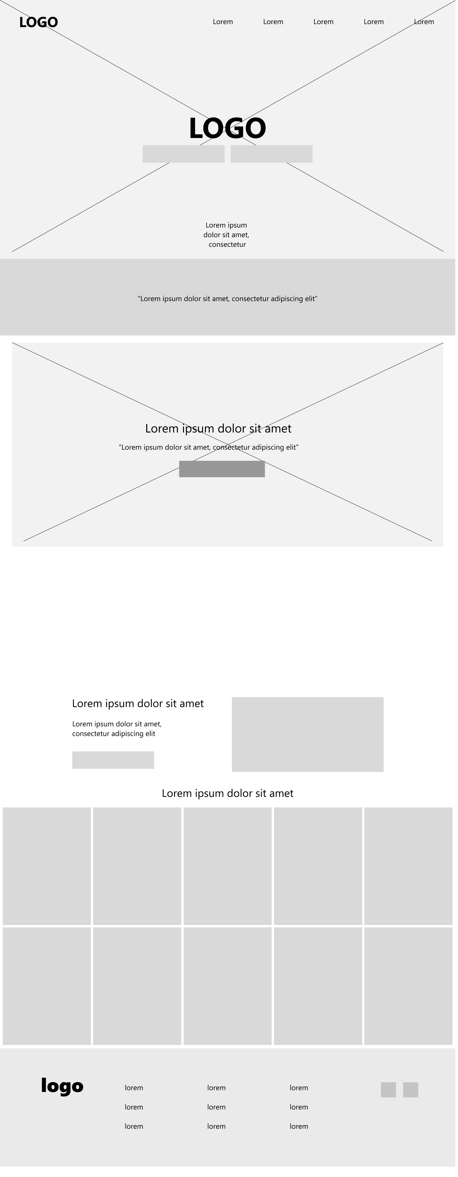
The original Sidekick Coffee website had limited functionality and provided insufficient information for users:
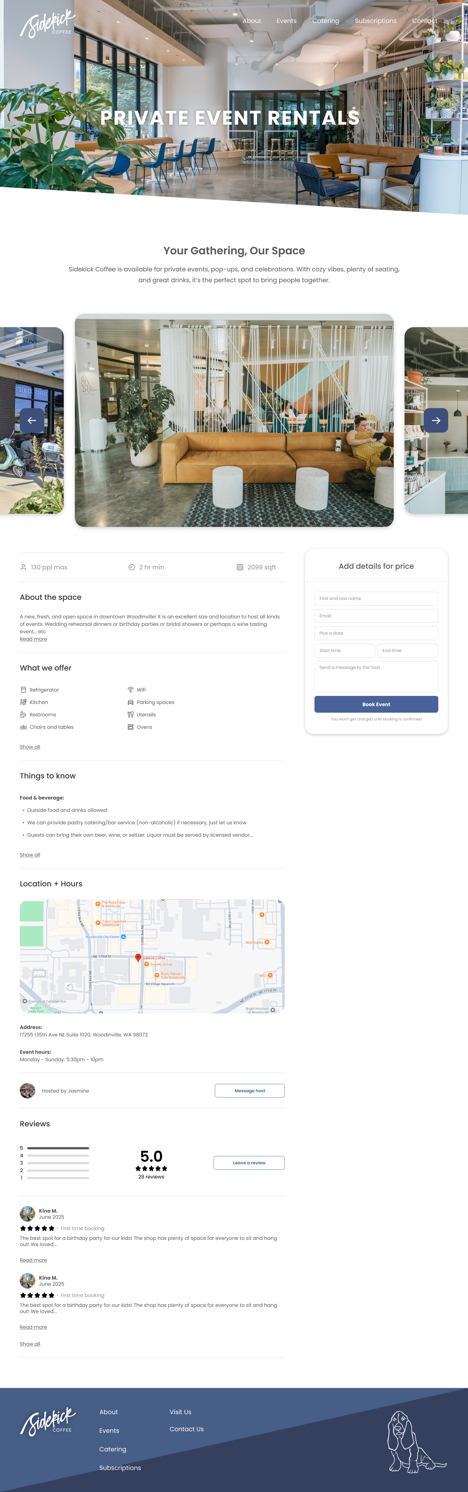
Minimal content across key sections: While navigation was straightforward, pages like Jobs and Private Events offered little value — the Jobs page only displayed “we’re not hiring” and a contact button, and Private Events redirected users to Square, adding extra steps and fees.
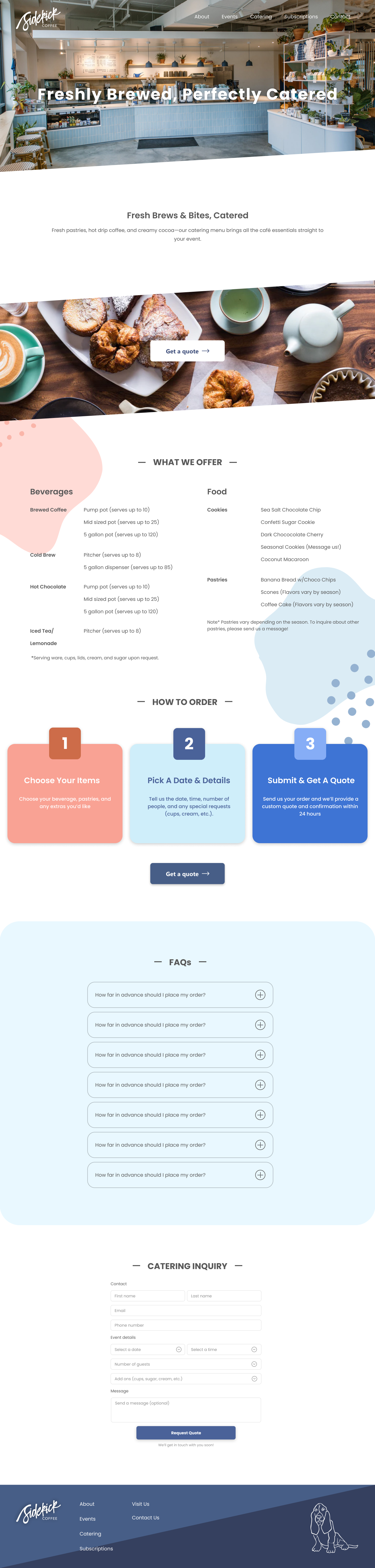
Catering information inaccessible: The catering page redirected to a Google Doc that often failed to load, forcing users to call or email the café, which was frustrating during busy periods.
Unused profile feature: A “Create Profile” button existed, but there was no clear reason for users to do so, leading to it being ignored entirely.
Visual design didn’t match the brand: The site’s look and feel didn’t reflect Sidekick Coffee’s personality, making the overall experience less engaging.
These issues limited the website’s effectiveness as a tool for providing information, promoting services, and engaging users.
Before the redesign


Research & Insights

To understand the challenges users faced and identify opportunities for improvement, I conducted a combination of stakeholder discussions, competitive analysis, and user observation:
Stakeholder discussions: I spoke with the café owners to learn what they wanted and didn’t want on the site, including priorities like showcasing catering, promoting private events, and maintaining the café’s brand personality.
User observation / informal testing: I reviewed the existing website with a few regular café visitors to see where they encountered friction. Users struggled to access catering information and had no clear way to book private events, often resorting to calling or emailing staff.
Competitive analysis: I looked at other local café websites to see how they presented catering, private events, and job opportunities. This highlighted opportunities to provide more complete, easily accessible information and integrate booking features seamlessly.
Key Insights:
Users wanted direct access to catering and event booking without redirects or broken pages.
Providing clear, valuable content across all sections (Jobs, Events, Catering) would reduce confusion and reliance on staff.
The site’s visual design and brand voice needed to reflect the café’s personality to engage users and encourage repeat visits.
These insights informed the redesign strategy, focusing on improving content, accessibility, and visual engagement while aligning with both user needs and the owners’ goals.
Ideation & Design Process
Based on the research insights, I began the redesign process with a focus on improving content accessibility, streamlining key actions, and enhancing the visual design.
Sketches & Low-Fidelity Wireframes:
I mapped out a revised site structure to make catering, private event booking, and job information more prominent and easily accessible.
Wireframes prioritized key user actions, such as viewing catering options and booking private events, without relying on external redirects.
Feature Prioritization:
I identified features with the highest user impact:
Functional catering page with menu and contact options
Integrated or simplified private event booking
Less critical features, like the unused profile creation, were removed to reduce clutter.
Feedback & Iteration:
I shared wireframes and prototypes with the café owners to ensure alignment with their goals and preferences.
Based on their feedback, I refined layouts, improved hierarchy, and adjusted content presentation to reflect the brand personality.
High-Fidelity Mockups:
I applied the café’s visual identity, including color palette, typography, and imagery, to create a cohesive, engaging, and brand-aligned experience.
Key interactions, like booking and contact actions, were designed to be intuitive and user-friendly.
This process ensured that the redesign was user-centered, functional, and visually aligned with the café’s brand, while addressing all previously identified pain points.
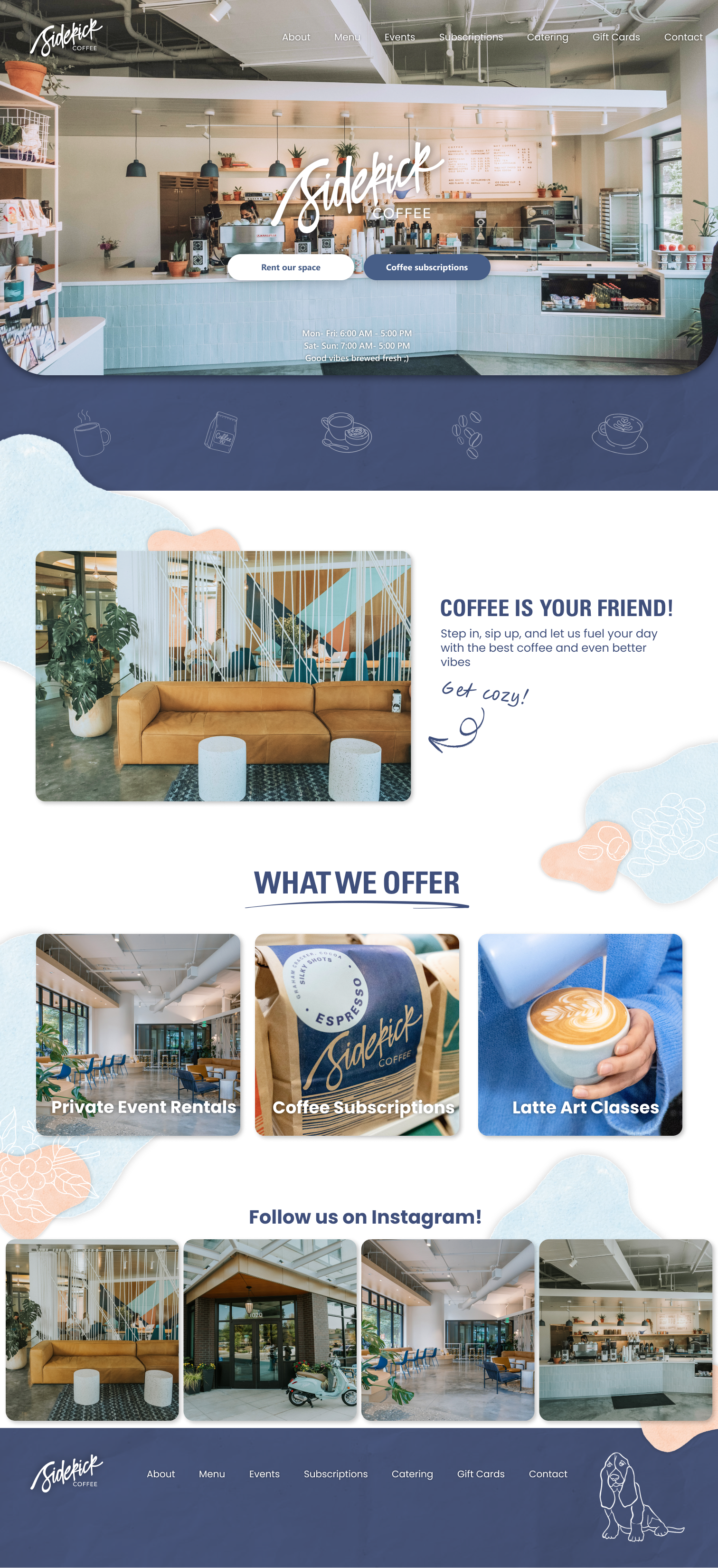
After the redesign

Visual Design & Results
*
Visual Design & Results *
The final redesign focused on creating a clean, engaging, and brand-aligned experience that addressed the key issues identified in the research phase:
Enhanced Navigation & Content Access:
Direct access to essential information without redirects or broken links
Clear, descriptive menu items for Catering and Private Events
Catering & Private Event Booking:
Functional catering page with menu details and a contact form
Streamlined private event booking that reduced friction and extra fees
Visual Design Alignment:
Updated color palette, typography, and imagery that reflected the café’s personality
Highlighted key actions through visual hierarchy and intuitive layouts
Removed Unnecessary Features:
Removed the unused profile creation feature to simplify the interface and reduce clutter
Results & Impact:
Users can now easily find catering information and book private events, reducing reliance on staff for inquiries.
The visual design better represents the brand, creating a more engaging experience for visitors.
The redesign improves overall usability and positions the website as a functional tool for both marketing and customer engagement.


Reflection / Lessons Learned
This project reinforced the importance of working closely with stakeholders, even in informal collaborations, to understand goals and preferences. It highlighted how a website can be both functional and reflective of a brand’s personality while addressing real user needs.
I learned the value of prioritizing content and features — removing unused elements like the profile creation button simplified the experience and kept the focus on what users actually need.
Finally, this project strengthened my skills in user-centered design, prototyping, and visual design, and gave me hands-on experience improving a real business website to create a more intuitive, engaging, and effective user experience.